Restaurant interior design is not just about creating a visually appealing space. It plays a vital role in setting the atmosphere, influencing customer behavior, and enhancing the overall dining experience. Color psychology is a key element of restaurant interior design that can make a huge difference and impact customers’ moods, appetites, and even time spent there. As previously discussed, lighting, furniture, wall art is all a part of developing a cohesive brand. Understanding color psychology in interior design can help restaurant owners create a more effective and inviting environment for their guests.
The Power of First Impressions: Why Sight Matters Most
When a guest steps into a restaurant, their eyes are the first to “taste” the atmosphere. The initial visual impression—whether it’s the bold pop of color on a feature wall, the soft glow of pendant lighting, or the playful arrangement of seating—instantly sets expectations about what kind of experience awaits. It’s this immediate, subconscious reaction that can influence everything from how long a guest lingers to how eagerly they anticipate their meal.
Savvy restaurateurs understand that before a single menu is opened or aroma wafts from the kitchen, the look and feel of the space communicate volumes. Creating intentional visual cues through color, layout, and décor helps tell the story of your brand and subtly guide customer behavior. So, by channeling the psychology of sight, restaurant owners have a powerful tool to not only attract diners but to shape their entire dining experience from the very first glance.
Why the Color of Your Space Matters
When designing a restaurant, choosing colors can have a significant psychological impact. Colors are known to evoke emotions and can affect human behavior in subtle but powerful ways. For example, warm colors like red, orange, and yellow are often used in restaurants because they are believed to stimulate appetite and energy. On the other hand, cooler colors
like blue and green are more calming and can create a relaxed, serene atmosphere.
Appetite-Stimulating Colors and Their Psychological Effects
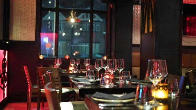
Certain colors have earned their reputation as appetite stimulants in the restaurant world—and not by accident. Red, for instance, has been widely adopted by eateries of all types, from cozy bistros to national chains. Why? Our evolutionary wiring responds to red; it’s a color frequently associated with ripe, energy-rich foods in nature. When used in a dining space, red can spark excitement and naturally encourage guests to order—and eat—more.
Orange is another powerful appetite booster. It’s not just an attention-grabber but also associated with warmth and a sense of comfort. Incorporating orange into your design can make your restaurant feel inviting and help guests connect those cozy feelings with your food.
Yellow rounds out this trio of appetite-stimulating hues. Known to evoke feelings of joy and optimism, yellow can subtly signal to the brain that something good—like a delicious meal—is on the way, sometimes even triggering the release of serotonin. The effect? A more uplifting atmosphere and diners who are primed to enjoy their meal.
Using these warm shades thoughtfully—through accent walls, décor, or even plateware—can enhance the sensory experience and contribute to both longer stays and satisfied appetites.
How Restaurant Design Shapes the Senses
Restaurant interior design is about much more than aesthetics; it’s a deliberate approach to engaging the senses and curating a specific atmosphere. From the moment customers walk in, what they see, hear, and feel shapes their first impressions and sets expectations for the meal ahead.
Sight is one of the most immediate influencers. The way colors, lighting, textures, and furniture are combined sends a message about your brand and the type of experience guests can expect. Whether it’s the energetic buzz from bold accents or the tranquil feeling from soft hues and gentle lighting, these details subtly encourage guests to linger, relax, or even eat a bit faster at lunch.
Sound, scent, and touch play their roles, too, but visual cues—especially color—often set the stage. By thoughtfully designing your space with sensory perception in mind, you’re able to nudge customer behavior, spark appetites, and ultimately shape the entire dining journey.
Practical Tips for Using Color Psychology in Restaurant Interior Design
When choosing colors, think about your restaurant’s overall theme or concept. A contemporary sushi restaurant might benefit from using calming shades of blue or green. In contrast, a vibrant Mexican restaurant could utilize warm tones like red, orange, and yellow to convey excitement and energy.
Experimenting with Color: The Power of Mood Boards
Before making any final decisions, consider assembling a mood board to visualize your interior palette. Mood boards are an invaluable tool, allowing you to play with various color schemes, textures, and décor elements in a low-risk, creative way. Whether you prefer cutting and pinning paint swatches, fabric samples, and magazine clippings to a physical board, or arranging digital inspiration photos on Pinterest, mood boards help you see how different colors interact under various lighting and with other design accents.
This process lets you experiment freely, mixing bold hues, subtle neutrals, or even unexpected color combinations until you achieve the ambiance you want. You might realize a splash of turquoise on accent walls energizes the space, or that muted earth tones convey the comfort you’re after. By seeing everything together, you avoid costly mistakes and can confidently select a color scheme that matches your restaurant’s brand and intended atmosphere.
Use Color to Define Spaces
Different colors can help define distinct zones within a restaurant. For example, you might use warm colors in the dining area to stimulate appetite and create energy while using cooler tones in the lounge area to encourage relaxation and conversation. Moreover, unexpected emergencies can arise when relocating a restaurant to a new location. The design, including color selection, must be adaptable.
You may need to store items while waiting for furniture or equipment installation temporarily. During these times, efficient organization and color-coordinated storage can keep the restaurant running smoothly, even during stressful moments like moving day emergencies. For instance, using neutral tones in the storage area can keep things visually consistent while managing operational and aesthetic priorities.
Pair Colors with Lighting
Lighting can dramatically affect how colors are perceived. A bright and energetic color during the day might appear more muted under low lighting. Experiment with different lighting options to achieve the desired mood and atmosphere.
Don’t Forget the Branding
When choosing interior colors, consider your restaurant’s branding. If your logo is green, for example, incorporating shades of green throughout the design can help reinforce your brand identity and create a cohesive experience for your guests.
The Psychological Effects of Popular Colors in Restaurant Design
Different colors can also shape the way customers perceive the space. For instance, red and yellow might encourage faster dining, ideal for fast food or casual dining establishments. In contrast, restaurants that want to create a more relaxed, fine dining experience may set aside a budget for richer colors like deep blues or muted greens to enhance comfort and luxury.
-
- Red—Often associated with passion, excitement, and energy, red can increase hearrate and stimulate appetite. It’s commonly used in restaurants that desire a high-energy, fast-paced environment. However, it’s best to use it sparingly, as too much red can be overwhelming.
- Yellow – Known for its cheerful and uplifting qualities, yellow can evoke happiness and positivity. It is often used in casual or family-style restaurants to create a warm, welcoming atmosphere. However, like red, it should be used in moderation, as it can be overstimulating.
- Blue – Calming has been shown to suppress appetite, making it an ideal color for fine dining or restaurants where the goal is to encourage relaxation and longer dining experiences. Soft, pastel blues can create a serene environment, while darker shades of blue can provide sophistication and elegance.
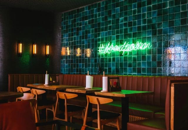
- Green & Turqoise -The Subtle Influence of Green and Turquoise on Appetite. While bold shades like red or yellow tend to ramp up appetites, green and turquoise offer a much gentler effect. These colors are often seen as mild appetite stimulants—encouraging a sense of balance rather than sparking cravings. Their influence makes sense when you consider how our brains interpret the color green: it’s the hue of leafy vegetables and unripe fruit, signaling nourishment and safety, but not the sugary energy burst our ancestors craved from vividly colored, ripe produce.In a restaurant setting, using greens and soft turquoises in the décor promotes a relaxing, restorative vibe. These shades subtly nudge guests towards mindful eating—making them perfect for establishments that want their patrons to linger over healthy, thoughtfully-prepared meals. Instead of overwhelming the senses, green and turquoise foster calm, composure, and a hint of freshness, reinforcing ideas of wellness and natural ingredients.
- Black and White—A classic combination of black and white can give a restaurant a modern and sleek look. Black often conveys sophistication and elegance, while white can create a clean, minimalist atmosphere. Together, these colors can help balance and elevate the overall design.
Evolutionary Roots: Why Some Colors Suppress Appetite
Interestingly, our aversion to certain colors in dining spaces, such as blue, black, and purple, can be traced back to human evolution. Historically, these hues were rarely found in natural foods, with most edible items displaying shades of red, yellow, green, or brown. Instead, blue, black, and purple often signaled that something might be spoiled, moldy, or even toxic—a biological warning sign for our ancestors to steer clear.
Because of these ancient cues, our brains can associate these colors with danger or unpleasant flavors, causing a natural decrease in appetite when they dominate a restaurant’s palette. This subconscious reaction is part of why blue lighting or dark color schemes may encourage diners to slow down, eat less, or even lose interest in a meal altogether, especially when compared to warmer, more appetizing tones.
Appetite Suppressing Colors: What to Avoid for Hungry Guests
Not all colors are created equal when it comes to encouraging appetites. Certain hues—particularly black, brown, blue, and purple—tend to suppress appetite and may not be the best choice if your goal is to get guests reaching eagerly for the menu. But why do these colors have this effect?
Historically, colors like blue, black, and purple have been associated with foods that are spoiled or potentially poisonous. Our ancestors learned to steer clear of these shades in nature, leading to an instinctive aversion that still lingers today. Unlike the reds and yellows that signal freshness and ripeness, these darker tones don’t appear as frequently in natural foods, so they’re less likely to whet the appetite. If you want your guests to linger and enjoy every bite, keep these colors to a minimum in the main dining area—reserve them for accent pieces or design elements where curbing hunger isn’t the goal.
Using Color to Influence Dining Behavior
In restaurant interior design, color choices can influence more than just the aesthetic appeal—they can directly affect diners’ behavior. For example, fast-food chains often use red and yellow because these colors are associated with quick service and stimulate appetite, encouraging customers to eat and leave quickly. In contrast, upscale dining establishments often use darker, more subdued colors to create an intimate and luxurious environment that enables customers to linger and enjoy their meals.
A restaurant’s interior design can influence dining behavior and create an atmosphere where customers feel comfortable and relaxed.
The psychology behind this is that brighter colors like red and yellow stimulate energy and activity, while cooler tones like blue and green are calming and can reduce the urgency to leave. This is especially important when creating an atmosphere where customers want to stay longer, enjoy multiple courses, or order more drinks.
Incorporating Storage Solutions with Color in Restaurant Interior Design
If you manage a restaurant, space can often be tight, and storing extra supplies can be challenging. Sometimes, the solution is simple: incorporate efficient storage units in your design without disrupting the aesthetic appeal. Moreover, the beltwaymovers.com website is a valuable resource. It offers a more practical look into using storage smartly and efficiently for various types of items. Their website shares valuable insight on how proper storage can be a game-changer for maintaining functionality and visual appeal in a restaurant environment.
How to Use Color Psychology in Restaurant Marketing
Incorporating color psychology during restaurant renovations affects the customer’s experience inside the restaurant, but it can also influence how your brand looks outside. Using the right colors in your logo, marketing materials, and website can evoke the emotions and moods you want to create in your physical space.
For example, a restaurant focusing on health-conscious food may want to incorporate green in its logo and interior design, signaling freshness and sustainability. On the other hand, a steakhouse might choose rich, dark tones like brown and deep red to convey warmth, richness, and bold flavors.
Concluding Thoughts
The impact of color psychology in restaurant interior design goes far beyond simple decoration. Colors can affect a diner’s mood, behavior, and even their decision to return. Understanding the psychological effects of different colors and thoughtfully applying them to your space can create a dining environment that enhances the overall experience, encourages repeat visits, and aligns with your brand identity.
HAVE QUESTIONS? ASK US | VIEW SERVICES | ABOUT
For deeper consulting solutions beyond the setup and launch of a restaurant, visit A2Zbusiness.consulting.
Click for digital marketing, website development, or platform tools
Images provided by Pexels: Image 1, Image 2, Image 3, Image 4